
Hey! Chris Coyier here. This is a blog-itized version of a presentation I created. It started life as a Keynote file which I presented in person at RenderATL in June of 2023. I put a lot of work into it! I’m so grateful to everyone who came and saw it. But you can’t beat the reach of websites! I decided I should get some more mileage out of it by sharing it here in an adapted form. I suppose you should read through this as if you’re watching a 45 minute presentation.
Allow me to set the stage.
By any measure, CSS has gotten a lot better in recent years. It’s gotten more useful features, better interoperability between browsers, and become easier to learn thanks to a concerted push toward making CSS a cohesive system free of quirks and hacks.
What matters though is the real world. Real websites. Real impact on the things we make and the people who use them.
It’s working.
And while all that is wonderful, this thoroughly scientific data is actually why I care so much about CSS:
Pie Chart
% of websites that use CSS
You think WordPress is big? Check out CSS #lolz.
Let’s look at 5 new CSS things that really matter to real-world development.
Logical Properties & Layout

Let’s get real-world right off the bat by looking at this article:

It’s pretty sweet.
It’s one of those “art-directed” articles specially designed outside the normal templates that a news website spits out. The kind of thing reserved for really special articles that are shooting for extra attention (and probably traffic). I bet it worked.
Designers and developers worked on this 👩🎨. I think they did a pretty decent job. It looks great, the type is nice, and it’s responsive.

I also think we can point to some things in the CSS of the article that could be replaced with newer CSS with tangible benefits. Or, at least help me showcase some points I wanna make about CSS ;).
One common thing to do in CSS for large screens is to limit the content area to the middle somewhere. Articles tend to read top to bottom and keeping the line length to a pleasing and readable level means a centered overall container is a decent way to go. There are tons of ways to do this, but here’s a common approach:
header {
max-width: 64rem;
margin-left: auto;
margin-right: auto;
height: 100vh;
}Code language: CSS (css)Notice I snuck in a height value using viewport units. That sets up the header area of this article. The designers intended for just one large photo to be seen when people arrive at the article, then tucked the post’s title to the bottom left of that header area.
Here’s a version of doing that same thing, only replacing the properties with what are called Logical Properties in CSS:
header {
  max-inline-size: 64rem;
  margin-inline: auto;
  block-size: 100dvh;
}Code language: CSS (css)
That achieves the same result. Rather than max-width, we’re saying max-inline-size, so instead of that metric being about the horizontal axis of the page, it’s saying “limit the size of the element in the direction of how the text flows.”, which, to me, makes sense since that’s the purpose of limiting the size at all. To follow suite, instead of height I’m saying block-size, largely just to illustrate the logical property version. Kinda cool and handy that, thanks to margin-inline, we now have a “both sides” shorthand for margin. Small win. 💪
So let’s be clear:
- inline = The direction of how text flows
- block = The perpendicular direction of how text flows
Maybe it’s easier to understand with crayon scribbles emphasizing the two terms:


For all left-to-right languages (LTR) like English, Spanish, French, German, etc and right-to-left RTL languages like Arabic, the keyword inline refers to the horizontal axis. The block keyword the vertical axis.
We’re talking layout here though, so picturing this in terms of rectangles-on-a-website, the blue arrows over the blue boxes show layout happening in the inline direction and the red arrows over the red boxes show the block direction.

These logical properties using these terms apply to all sorts of box model and layout CSS things. The other keywords you need to know are that start means literally where the text starts to flow from: left in LTR and right in RTL. Then end is the end. You get it.

If you’ve been writing CSS for a while and haven’t used logical properties, they can feel a little weird, but you can learn it. You’ve learned much harder things.
Logical Properties make for a slightly easier-to-understand model because the words are more consistently used.
Here are a few examples:
| Non-Logical Property | General Logical Property Equivelant |
|---|---|
| width | inline-size |
| right | inset-inline-end |
| margin-left | margin-inline-start |
| overflow-x | overflow-inline |
| resize: horizontal | resize: inline |
| text-align: right | text-align: end |
Notice how the logical properties are less randomly named than the non-logical properties. The x in overflow-x is one of just a few places in CSS where we’re supposed to understand it means “the x-axis” like in geometry class. The horizontal value for resize is an even more rare CSS word choice. It’s not terribly complicated, but it’s not nearly as cohesive of a system as logical properties are. Logical properties get the 🏆 for cohesiveness. The longer I do computers, the more I appreciate well-named things and cohesive systems.
I think Rachel Andrew said it best:

I think Rachel was referring to CSS as a whole, but logical properties are part of that story. Anecdotally, I still see plenty of “I hate CSS” sentiment around our industry, but it’s usually not jabbing at CSS being bad — it’s the person jabbing themselves for being bad at it. That’s a change in sentiment I’m noticing. In general, even people that don’t focus on CSS correctly regard CSS as powerful and capable.
There is a bigger and more important reason to use logical properties though: translation. The Learn CSS course has a great example.

Let’s use some more of these logical properties on the ‘I just wanna surf’ article we looked at earlier and reap some benefits. The CSS that places the header of the article currently is like this:

That’s not wrong; it’s just not using logical properties.
If we send this website through a translator like Google Translate to get it into a right-to-left language like Arabic, it comes out like this:

I showed this result to a woman I know who is fluent in Arabic and she was like “it did fine, actually.” and I was like aw snap, that’s not really helping me make a point here, maybe this stuff isn’t that important. But then I said “isn’t it weird that the text is hugging the left and left-aligned?” and she said, “well, yes, but that’s just what you get in situations like this.” Translating websites notoriously yields crappy results. In this case, because the words were translated decently, that was all she expected to work.
To get a better result, we can update the CSS a smidge with logical properties.

By not using non-logical properties like “left”, and instead saying alignment should happen based on the natural flow of the text in that language, we can have the text go into the more appropriate bottom-right position during translation:

I’m 94% sure that the designers of this template put that black gradient in the header to help the text be more unreadable. Unfortunately, there is no logical properties for the direction of gradients, hence the above image where unfortunately the black isn’t helping the Arabic text pop like it should. Hopefully, we’ll get something like this soon:
header {
  background: linear-gradient(
    /* doesn't exist at time of publishing */
    to inline end,
    black, transparent 50%
  );
}Code language: JavaScript (javascript)
Look how nicely it would translate then:

What is notable about this to me is that no additional CSS needs to be written. It’s not really any more work. The second the language direction changes, the whole site flows into place in nice, expected, sturdy ways.
I did verify with my Arabic-fluent friend and she confirmed this is a big improvement. She had another suggestion:

“But Chris!” you say.
“I’ve never had translation be a requirement on any website I’ve worked on.”
OK? I reply. I have. But I see where you are coming from. There is no language switcher dropdown on this page. It probably wasn’t talked about in meetings much. Nobody was praised or scorned for the translatability of this page on that team, I would think.
But it’s in the vein of accessibility. Like it or not, people use your website how they want or need to. Their bodies and minds are different just like their devices and capabilities are.
Is there any evidence that people actually do translate websites on their own? There sure is:
- The Google Translate plugin has 10,000,000+ users, which is such a high round number it kinda seems like that’s the highest number they put on those pages.
- Similarweb, the website I see quoted the most for estimated traffic numbers, says the Google Translate website had 713M visits last month.
- And sometimes, we don’t even know when translation tools are used. For example, Chrome-based browsers will offer to translate articles with in-browser suggestions. Here’s Arc:

So I’ll just say this one last time as clearly as I can:

While I’ve now related this to accessibility, I noticed an unfortunate thing about this article. While all the images are <img> elements, which is great, because they are part of the content of the article, they lack any alt text whatsoever. Even the wonderful header image, which would have been tempting to make a background-image because of the text placed on top of it, is correctly an <img>, but no alt.
This is a little tricky territory because these images are by a bonafide artist. I think ideally you’d want the artist writing descriptions for them, not just some ho-hum front-end developer like me. And certainly not some “AI” tool or something.

If anyone with vision problems wanted to experience this article, which they absolutely should be able to, they would get some sense of the photographs because the article does describe them a bit, but they would miss out on most of the emotion of the photographs. I like how Jake put it recently:

Perhaps something like this? I dunno I’m not very good at it but you gotta imagine this is something of an improvement:

With that brief information, perhaps someone might be able to, say, recognize the exact pier in the photo if they had been there before or the like.
Let’s stay on this article header area for a moment longer.
You know how early on we set block-size: 100vh;? That made the header area, of which the header photo is in, exactly one viewport tall, achieving the look the designer was going for. But on the web, we have no idea how tall that is actually going to be, nor how wide. That means it is an unknown aspect ratio, and usually when you go messing with an images aspect ratio, you squish it or stretch it in awkward ways. That’s being avoided here with object-fit: cover; which is a nice touch. It crops, so you gotta be careful there, but works nicely here.

See above I actually used dvh units or Dynamic Viewport units. They are just better. It was inconceivable to many, including me, that on mobile browsers, viewport units didn’t account for browser chrome (e.g the URL bar), and thus it was all-too-easy to position things in places that got overlapped. Like this:

I mean what in absolute hecking heck, right?
Fortunately dvh totally fixes this problem and is supported everywhere so we should largely just use them instead. This checks off one of the most-requested CSS improvements int he last few years. I tossed in logical property usage here just for good measure:

You can see it behaving well as the browser UI changes in this video:
Thank jeepers.
I want to mention a couple of other quick things about layout before we move on to the next section.
CSS Grid!
Not particularly new, but it’s great. You should use it. I love flexbox and all, it was good to me, but the popularity of that guide kinda speaks to flexbox being a bit funky and hard to learn (or at least remember). I’m still not sure if I could really clearly explain exactly how flex-shrink works, for example. I like how grid lets you set up most of what you want to happen right on parent element. Browser support is essentially identical to flexbox, and yet…

I have doubts about how reflective that data is regarding how much developers reach for these different layout tools (that’s what “adoption” means to me). If WordPress switched out their columns implementation from flexbox to grid, I suspect we’d see a massive swing on this chart, even though the number of developers reaching for grid as they write CSS didn’t change. I bet it would be interesting to gather the data from parsing the data from new non-fork repos on GitHub instead.

Poking around the web, I see loads of sites using grid. I like how DevTools makes it really obvious because of the little (grid) badge in the DOM tree.
The big news at the moment is that subgrid is almost usable across browsers. Chrome was the holdout on that, but a little bird tells me it is likely within a release or two away.
Subgrid is simple to understand! Thankfully.
The entire subgrid explanation: do I want this element, which is already placed upon a grid, and is also its own grid, to inherit the parent grid lines? If yes, you can suck in those parent grid lines (rows or columns) easily:
.use-my-parents-grid-lines {
  /* element is on a grid */
  grid-area: a;

  /* element also is a grid */
  display: grid;

  /* rather than set up new grid lines,
     use parent grid lines */
  grid-template-columns: subgrid;
  grid-template-rows: subgrid;
}Code language: CSS (css)
Clean and useful, I think.

Peaking into how Figma lays out their sidebar of tools, you can see they achieve such a clean cohesive look despite so many little controls by setting up and using a strict grid. This is just one tiny little use case, but I think about subgrid here and how they wouldn’t have to establish those grid column lines anew each time, they could set them on a parent and inherit them.

One more grid thing.
You know Pinterest? It’s one of the more famous layout looks on the web because of the distinctive “sideways brick wall” look which ultimately became known as “masonry” layout (probably thanks to David).
The look is distinct because the web doesn’t normally flow like that. I mean… it kinda does with columns or vertically-flowing flexbox with wrapping, but even those aren’t very highly used and are a bit frowned on when they span more than one viewport in height, because as you read or tab through content you have to scroll up and down to do it. Plus tabbing vertically is just weird; the expectation for tabbing through content is to follow the inline flow of the text, so left-to-right and top-to-bottom in English.
Good news, with one quick line of CSS you can do away with rigid row lines in CSS grid and get that masonry look:

And again the point of this is that it retains natural tabbing order as best it can, which can’t really be done any other way aside from using JavaScript.


Here’s a video showing how the tab order remains logical:
OK! Moving on!
Container Queries & Units

Container queries are fricking awesome. In today’s component-driven world, they make pure sense. But they get all the love, so let’s start with container units first — just for fun.
First things first, you can only use container queries or container units if, well, you have a container. The easiest way to make a container is a wrapping element. Now any children of that container can use container queries or units. That children thing is a real gotcha. You can’t style the container itself.
.box-parent {
  container-type: inline-size;
}
.box {
  padding: 10cqmin; /* 👀 */
  font-size: 5cqi; /* 👀 */
}Code language: CSS (css)
You can see above the parent becomes the container, and now I can use container units on the child. Excellent. Aren’t those weird looking? It’s kinda like how there are a ton of viewport units but 90% of use cases are best served with vw and dvh. Here, cqi means “container query unit, inline”, which I suspect will be the most generally useful one.
Why are they useful? They help with fluid type, one of my favorite nerdy CSS things that I feel has solid practical use. I love fluid type generally, for example, this kind of approach, where type is size using the viewport as a sprinkle of influence over the overall font size, and it’s “clamped” so it can’t get too big or too small. Lovely. But that doesn’t help at the container level!
It almost makes more sense to size type based on the size of the container it is in. Or at least have that as an option.
Here’s an example. Say you’ve got all your font sizing set up nicely for large screens. Then, obviously, your site is responsive, so you’ve got that enabling meta tag:
<meta
  name="viewport"
  content="width=device-width,initialscale=1"
>Code language: HTML, XML (xml)
If all you did was, for example, set one size for your header in pixels, you’ve got this problem:

This is not a hard problem to solve. It’s one of the first things we do when we’re doing our responsive work.
h2 {
  font-size: 42px;
}
@media (max-width: 500px) {
  h2 {
    font-size: 24px;
  }
}Code language: CSS (css)
Annnnd done. I mean, probably don’t use pixels for font sizing, but this honestly isn’t a terrible solution. But it’s not optimal either. It doesn’t scale nicely between viewport sizes, it’s just one size or the other. If you want a few more scale points in between, it means more media queries and more hand-picked choices. Then doing it again for all other text-y elements. It’s pretty verbose and strict.
Now check out a new approach using container units, which scales much more smoothly and is very easy to set up:
That’s incredibly cool if you ask me.
“But Chris!” you say.
“You’re moving the entire viewport there, you could have just used viewport units to size the type!”
You’re right. But that’s just happenstance. Check this demo out where you can really see how the type is sized based on the container size because the viewport isn’t changing at all:
Fluid type in general is a pretty progressive way of doing type sizing systems, let alone incorporating container units into the scene. The best article I’ve seen so far doing it is Stephanie Eckles’ Container Query Units and Fluid Typography — so check that out for building something more comprehensive.
So without further ado, container queries themselves.
This is a big thing because our industry has broad agreement that websites should be built with components. Designers agree that building design systems out of components small and large is the way to go. Some agencies only deliver websites in that fashion. All JavaScript frameworks these days agree that you should build components and compose them together as works best for your project. Native web tech offers components now. Developers like that mental model and people seem to understand it. The grand metaphor of LEGO bricks holds strong. We did it gang. It took a minute, but this is the correct system for building digital products.
So you’ve got these components, and part of the point of them is that you can use them wherever needed. They aren’t prescriptive on where exactly they should go in terms of the entire page layout. We already don’t know how big any given screen is, but we also don’t know how much of that screen one component gets.
Lemme get my markers out again:
Where is that compont going to go? Is it the entire size of the screen? Is it within a sidebar about 1/3 of the width of the screen? Or on the other 2/3? Or in some tiny box elsewhere? Or centered in the footer? Who knows! But notice: the viewport didn’t change in those examples.
That un-known-ness is what makes container queries so great. The size of the viewport might be exactly the same, but a component has drastically different sizes.
The viewport is not a reliable proxy for how big a component is.
This demo I think does a decent job of showing off a component sitting on a page where the viewport doesn’t change, but the space available to it is variable and thus reconstructs itself to make use of the space. Little lil’ mini responsive design just for itself. Nice. This demo is a native container queries implementation of a Philip Walton demo from a while back that used a JavaScript-based approach we no longer need.
Again, you need an actual “container” to do this, and you can’t style the container itself. A little wrapper <div> never hurt anybody though; that’s what I always say. That plays out like this:
<div class="calendar-wrap">
  <div class="calendar">
    ..
  </div>
</div>Code language: HTML, XML (xml)
.calendar-wrap {
container: Calendar / inline-size;
}
.calendar {
...
@container Calendar (max-width: 690px) {
}
@container Calendar (max-width: 360px) {
}
}Code language: CSS (css)Notice I’m sneaking in a little native CSS nesting there. As I write, just waiting for Firefox on that one since it’s dropped in Safari and Chrome already. Nesting here feels pretty nice as to not have to repeat that top-level child selector.
I wonder if we’ll ever actually get @custom-media? That’d be cool. Feels like we should be able to variablize both media and container queries if we so pleased.
Oh, and your homework this time is to look at Style Queries. They are also kinda under the container queries umbrella. The most compelling part about them to me seems to be setting one property (probably a custom property) and getting a whole bunch of side effects. Basically a Sass @mixin only native and more dynamic.
Cascade Layers

I think all this Cascade Layers stuff is neat, but it also blows my mind that it got through the whole standards process and was delivered to browsers across the board so quickly. It’s extremely wild in how it upends a lot of what you and I probably have pretty locked into our brains about how styles are resolved and “what wins” when dealing with CSS and HTML. All a sudden, a selector with much less specificity might “win” because it’s a higher cascade layer. Let’s get into that.

Not a trick question above. That first selector on the left is far more powerful. If they both matched the same DOM element, that background would definitely be blue.
Well. By definitely I mean maybe.
If those selectors were both in the same cascade layer, which they would be by default if you don’t intentionally do anything with cascade layers (@layer), then yes, the former “wins”. But if that nav selector is in a higher layer, it will win, regardless of specificity.

In the example above, the pages layer would be the highest layer because it comes later in the source order, but on that first line, we declared the exact layer order we want, so overrides is the highest layer and that nav selector thus wins. You don’t have to declare an order, but it’s probably a good idea.
This is weird stuff! I’m not even going to get into how layers exactly reverses how !important works in CSS, making !important declarations in lower layers more powerful than higher layers. Too much. Too much.
Cascade layers do add to CSS, the language; thus, there is now more to learn and know. But does it make usage of CSS more complicated? That’s hard to know. I’m not sure I have enough experience using cascade layers to tell yet. But Miriam thinks dealing with cascade problems is one of the more predominant problems people have in CSS and she was behind a lot of the thinking behind this feature, so she presumably thinks it’s a solution.

I can imagine one common situation where cascade layers would be awfully helpful, and how easy it is to implement it is pretty darn cool.
Consider Bootstrap. Easily the most popular CSS library ever. Tons of people have used it and mostly successfully. I’d say Bootstrap is a big net win for the web. People want nice-looking styles without doing the detailed work of doing it from scratch. Great.
But haven’t you heard horror stories too? Or lived one? Sometimes the way it gets implemented is really strange or problematic. Like loading the entire library when only a little bit is used. Like trying to customize it but struggling with that and not being sure how to upgrade after monkeypatching. Like loading multiple copies of it because omg who even knows what is happening anymore. But the most common problem I’ve heard about? (I’d like to think I’m qualified to know about people’s problems as I’ve had a write-in-question web development podcast for a decade): overrides.
Here’s me using too-weak of a CSS selector for my override to work:

The problem is that people use Bootstrap, then need to override some aspect of it, and instead of doing that in some chill, normal, maintainable way, they use super powerful CSS selectors to override things (then do it again, and again). Or they use !important rules. This is born out of not knowing exactly how best safely and maintainable override the CSS that Bootstrap provides. (And I hope this is clear: this applies to any CSS library or even a project’s own CSS).
So what can you do? How does cascade layers apply to this?
We can use cascade layers to essentially demote the entirety of Bootstrap.
Here, my @import of Bootstrap is plunked onto a layer. Note: we don’t even have to name it, and we can use this keyword instead of @layer while importing.
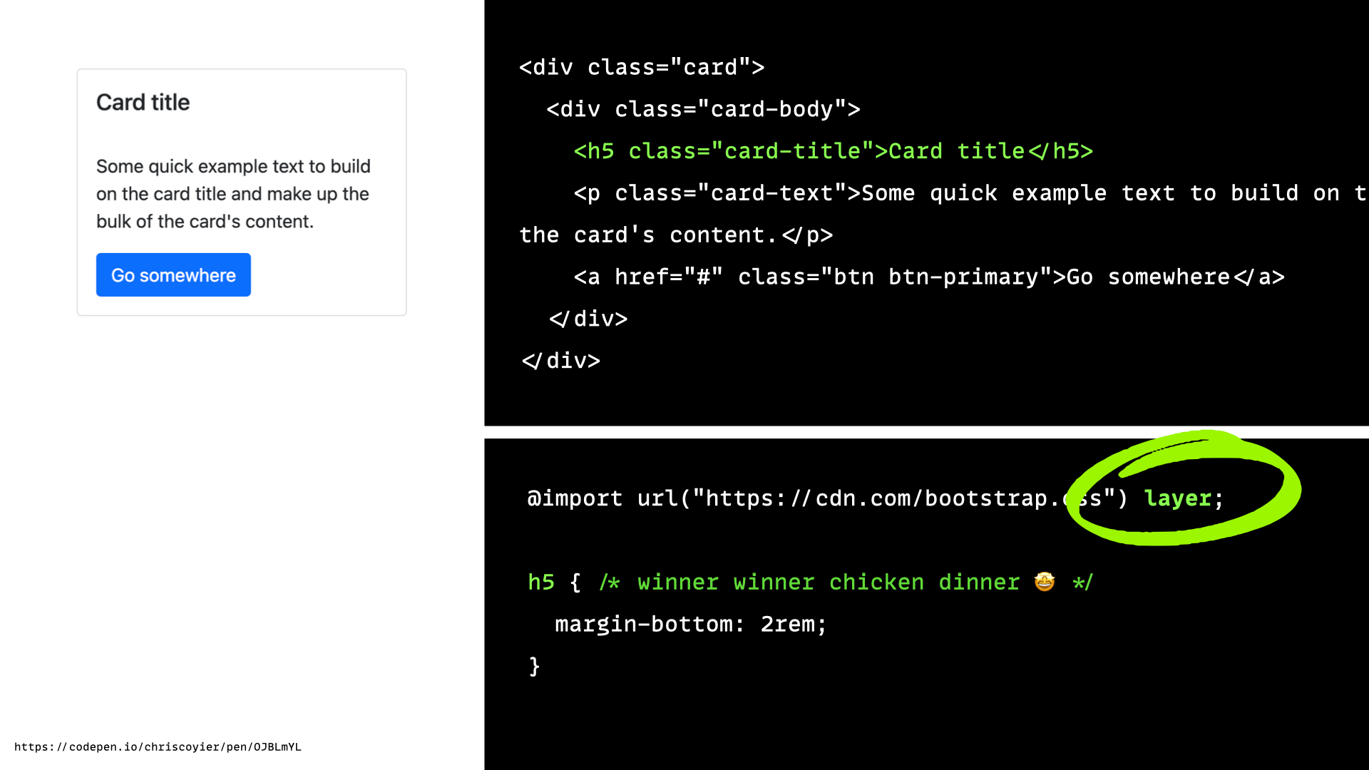
Now my super weak CSS selector in which I’m trying to override header margin does win. It wins because “un”-layered styles are the most powerful, like the “highest” layer. Wild. My guess is that if you did this on a new project, over time, you’ve have less annoying CSS selector conflicts, escalating specfiicty, and !important wars.

It will be interesting to see cascade layers shake out of the years. Will most projects adopt it? Will it linger in obscurity? Will it be thought of as largely a way to handle third-party styles? We’ll see.
Quick one for the spec and browser people: layering on @import is good to have, but I’m not sure people @import that much in native CSS. It would be nice to declare a layer at the HTML <link> level, if possible. Way more third-party CSS is loaded that way.
New Colors

That’s right everyone. That’s squirple above. I just eyedropped it from a sunset photo off my new RAZR phone. Only kinda kidding.
This stuff is complicated but here’s my attempt at explaining.
- The real world has all the colors. I’m pretty sure.
- We build displays that can only show some of the colors. That was obvious in the early days. Think about the one-color screens from Wargames. Then there was 16 and 256 and “web safe colors” and all that. Then we just started saying “millions of colors” which is what the rgb-based color models could do. Monitors and web tech like CSS were in sync! This period encompasses my entire computing life until now.
- But now, displays can display “billions” of colors, but we didn’t have any way to tap into color spaces capable of that in CSS.

Isn’t that weird?! I wouldn’t have guessed in a million years that a color model would just be incapable of displaying some colors. Like maybe there are gaps between colors, but we’d have the extremes covered. Or that as monitors became more capable, we’d just crank up the numbers higher. Or something! No limit to numbers!
But nope. Our long-lived and lovable sRGB color model is limited largely in the bold and vibrant areas. Kind of a bummer way for color to be limited!
So what do we do? We make new color models that support more colors and catch up to what displays can do. One such model is “P3”. But to use it, we need new color models that can use it. And that ends up expressing itself in CSS in a variety of ways. One of those ways is new color functions. There is so much to cover with all this that we just can’t hope to do it all, so let’s just do one:

OKLCH is a color model that can display colors in the P3 color space, which can do everything that sRGB can do and more, and it is also ready for color models that go beyond P3. So it’s a good choice for now and the future.
It’s not weird to look at:
body {
  background: oklch(50.44% 0.216 255.71);
}Code language: CSS (css)
That’s what I mean by color function. It’s just like rgb() and hsl() and whatnot that we’ve had for ages.

I think the graphic above (hoisted from oklch.com) is very helpful in understanding what is going on here. That whole slice of colors above where sRGB stops are new colors that we literally couldn’t use before. And above P3 is rec2020 which, as you can see, unlocks even more colors that are even more bold and vibrant.
That’s the thing: these newly unlocked colors look pretty freakin’ good.
Sometimes you are picking a color and really trying to make it as vibrant as you can. These new colors are really helping designers do that. Sometimes the closest color in sRGB looks anemic, especially as you start seeing more and more P3 colors.


Color models live in a 3D space, if that wasn’t obvious. Three numbers, three axes = 3D.
I like looking at it because it reminds you that, like the art-directed article we looked at in the beginning, this was designed. Different color spaces and models have different designs, so they have different useful attributes. And weaknesses! We’ll see some of those attributes in a bit. But don’t forget about the more vibrant colors, that’s probably the biggest one. In fact, some designers think of these colors as a secret weapon:

Because CSS is well-designed, we can use these colors entirely safely. For example, we have @supports we can use to see if browsers understand the syntax. That’s what Panic does. One set of colors for HDR, one for SDR:

The syntax you see above uses the color() function, which is just a generic function where you can declare any color model, display-p3 just being a different one clearly capable of displaying P3 colors. With OKLCH we could do a fallback situation like…
html {
  --brandYellow: hsl(53.81 97% 58%);
  background: var(--brandYellow);
}
@supports (color: oklch(0% 0 0)) {
  html {
    --brandYellow: oklch(91.91% 0.22 102.16);
  }
}Code language: CSS (css)
I’m tellin’ ya, picking these new vibrant colors is satisfying and might be just what your website needs to stand out. But don’t take my word for it:

Let’s look at some other aspects of oklch() specifically. One benefit that comes from its design is your ability to manipulate the values. I always like that about hsl(). It gave you a way to adjust the color by hand if you needed to. Need it lighter, well, reduce that “l” value then. Just one more thing you don’t need Sass for. It’s also much easier to program around if need be.
OKLCH keeps all that same adjustability and programmability.

The “h” is hue, move the hue number and the hue changes. The “l” is lightness, move the lightness number and the lightness changes. The “c” is chroma and it’s basically like saturation, but I’m not taking any questions.
But here’s another killer feature: uniform brightness! If you’re dealing in hsl() — a bunch of colors with the exact same lightness will very definitely not actually look like they are the same lightness. Weird but true.
But let’s do it in OKLCH. Here’s a bunch of colors with the same lightness but different hues:
oklch(70.5% 0.111 0),
oklch(70.5% 0.111 30),
oklch(70.5% 0.111 60),
oklch(70.5% 0.111 90),
oklch(70.5% 0.111 120),
oklch(70.5% 0.111 150),
oklch(70.5% 0.111 180),
oklch(70.5% 0.111 210),
oklch(70.5% 0.111 240),
oklch(70.5% 0.111 270),
oklch(70.5% 0.111 300),
oklch(70.5% 0.111 330),
oklch(70.5% 0.111 360)Code language: CSS (css)
If we used those as color stops in a gradient, well, look:
All those colors really actually feel like they have the same brightness.
Oh, the hue manatee! (get it? ughkh)
It’s not even that they math-ed their way into this. This stuff is all based on human research, where they asked people how bright they thought stuff was and build parts of the model around that data. So it’s based on our brains and how our eyes work. Neat stuff.
So we looked at how color models are designed and how those designs have meaning and practical purpose. The design of sRGB has low saturation colors in the middle. One side effect of that choice is that when colors are interpolated from one to another, like in a gradient, they can go through that low-saturation area. THE GRAY DEAD ZONE!

This isn’t the world’s biggest problem. Gradients support multiple color stops, and if you want to color the absolute heck out of how they look, you can do that. But it is interesting, and it’s common for many of us just to put two colors and let what happens happen.
good news everyone
You can say what color model you want to use in a gradient now. It’s easy:
While I’ve been trying to convince you OKLCH is cool (and it is), I think OKLAB is generally the best color model for gradients. OKLCH tends to go vibrant, which can be nice, but also it does some weird stuff, going through color territory you don’t expect. You really gotta look and test.
This is a fun scroll:
Sorry about that. I feel like knowing this much about colors kinda ruins your brain like when you learn about kerning in typography. From that point forward, you’ll see every kerning fail for the rest of your life.
The Pen above is from Adam Argyle, who I’ve learned a lot of what I know about this. Here’s another favorite from Adam, who shared the fact that you can tell gradients in CSS to “go the long way around” while interpolating if you want. So a gradient from “red” to “red”, which you’d think would be “red” is actually a full rainbow in HSL because it’s modeled that way:

Let’s recap OKLCH:

If you’re worried you might not remember the weird new name “OKLCH” try singing this loudly:

Excellent term via Eric Portis.
One more thing on color.
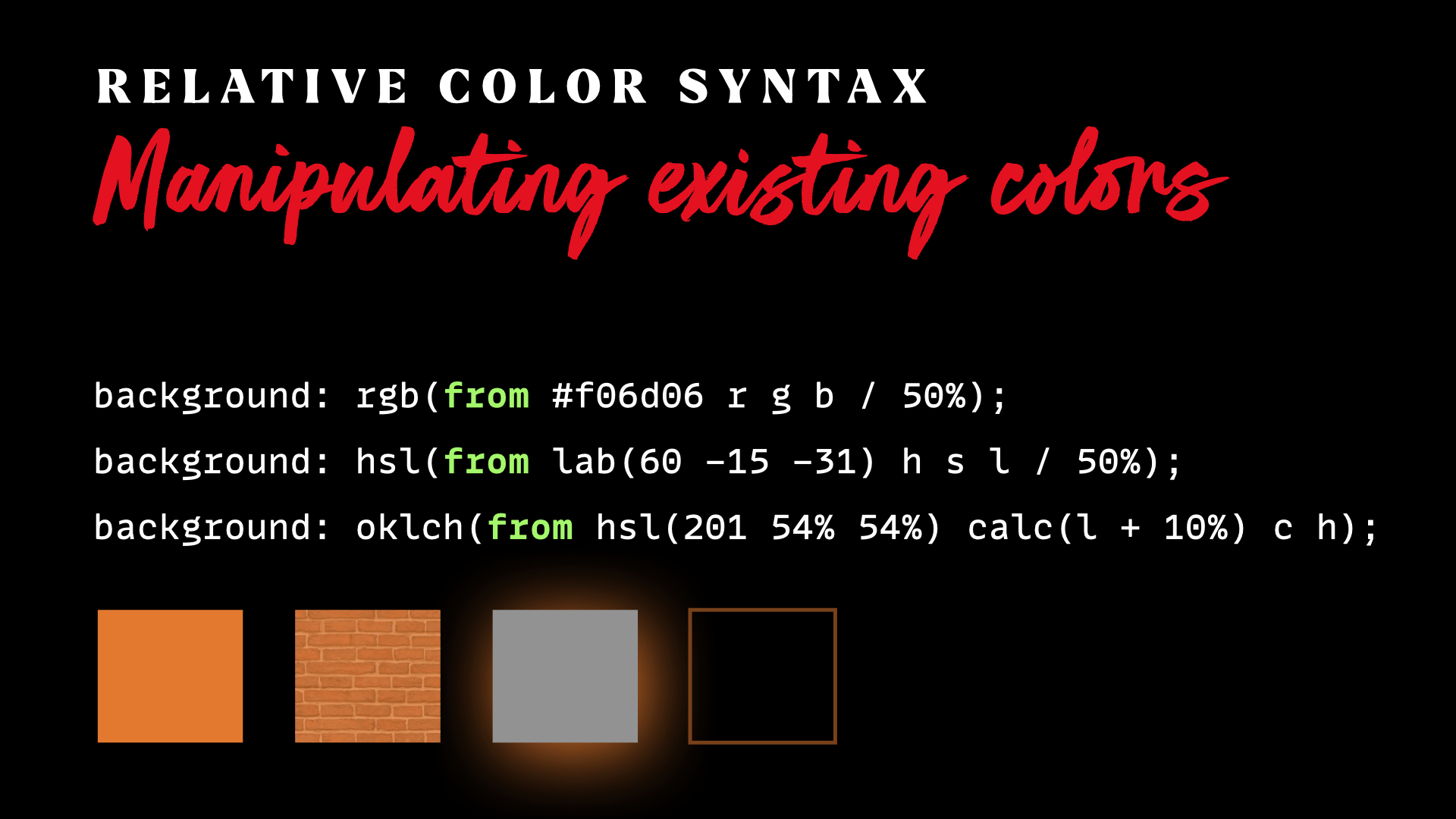
It’s come up several times for me recently where I have a defined color, and I needed to add transparency. Like I need to layer the color over an image, or a box-shadow or border needed a transparent version of the color. A great example of a future CSS color feature: relative color syntax. The point of it is that it allows you to pass in an existing color and then manipulate it.
The from keyword is the main thing here. You use existing color functions and start with that keyword so it knows what is going on, then it allows you to destructure-and-manipulate the parts of the color syntax you are moving toward.
background: rgb(from #f06d06 r g b / 50%);
background: hsl(from lab(60 -15 -31) h s l / 50%);
background: oklch(from hsl(201 54% 54%) calc(l + 10%) c h);Code language: HTTP (http)
What’s happening in those lines?
- A HEX color is converted to sRGB and 50% transparency is applied. (We did it!)
- A LAB color is converted to HSL and 50% transparency is applied.
- An HSL color is converted to OKLCH and the lightness color is boosted.
This provides amazing manipulation ability over colors.
Sure, you could set up all your colors ahead of time with variations for everything you could possibly need, but having more on-the-fly control is both more succinct and more powerful.
This doesn’t even use the relative color syntax, and you can still see how entire color palettes can be generated programmatically with light amounts of code:
View Transitions

I think taking a look at how much animation there is in mobile applications and operating systems is a good way to frame this. You see it every day, but just look again:
Every app you open and close. Every screen inside every app. Every menu. Every everything. It all moves. It just isn’t like that on the web. We have good animation tools on the web, but they aren’t used in the same way. We just don’t animate everything like mobile does. And I’m not necessarily saying we should. Too much movement on large screens is, as Dave said once “a vomit comet”. It’s less overwhelming on mobile, and you fingers are covering some of it, so there is more need for the wayfinding help that transitional movement brings.
But! We also don’t have all the tools we need. There really is no way at all to do animations in between page loads. Believe it or not, some ancient versions of Internet Explorer had them, but they were weird and lame and never standardized. No star wipes for us.
Until now.
Enter the View Transitions API.
It comes in two flavors:
- On-page animations via a JavaScript API
- Between-page animations, no JavaScript required.
Both of them are super friggin’ cool.
The first is a one-liner:
document.startViewTransition(() => updateTheDOMSomehow())Code language: JavaScript (javascript)But let’s not break browsers that don’t support it, so:
if (!document.startViewTransition) {
  updateTheDOMSomehow();
} else {
  document.startViewTransition(() => updateTheDOMSomehow())
}Code language: JavaScript (javascript)
That’s it really. It snapshots the DOM (literally makes a raster image behind the scenes) before and after your updates and does an animation between those two “states”. By default, you get a cross-fade kind of thing, which can be OK, but to me, the real magic comes in when you tell individual elements they should tween to their new state. This is done via CSS (!) by giving things a view-transition-name. See this video where I hello-world that concept:
Watching that simple <div> tween itself with no special animation code in either the CSS or JavaScript is really cool. You can also control the animation in CSS if you want — you aren’t stuck with that default animation. I’ll let you explore all that, but it’s fairly straightforward, using “a pseudo-element tree” giving you control over different aspects of the animation as needed.
One of the first things I tried was “list” animations, because 1) it’s kind of a tricky thing to pull off 2) it’s a good real-world use case. Lists should help you understand what is changing about them! In this demo below, each list item has a unique view-transition-name, that way when the DOM updates, each of them can move individually, so space can be made even in between list items.
I don’t think there is any limit to how elaborate this can get.
We need to move on though, because we haven’t gotten to the second “flavor” of View Transitions yet, which is a much bigger deal for the web as a whole. Before this, it was literally not possible to animate between page transitions. As in, when a user clicks an anchor link with the default behavior and a new page loads, you can’t do any animation during that time. If you wanted this behavior, say, to make it feel more like a native mobile app, you were forced into an architecture where the page never reloads (the origin of the term “single page app” or SPA).
Now let’s look at the door that was opened.
Take a gander at these two super basic JavaScript-free HTML pages. The first links to the second via anchor link. I’ll highlight the few sprinklings of View Transitions code:
<!DOCTYPE html>
<html lang="en">
<head>
<meta charset="UTF-8">
<meta name="viewport" content="width=device-width, initial-scale=1.0">
<title>Home</title>
<link rel="stylesheet" href="./style.css">
<meta name="view-transition" content="same-origin" />
</head>
<body>
<div class="grid">
<a href="./one.html" style="view-transition-name: one;">One</a>
<a href="./two.html" style="view-transition-name: two;">Two</a>
<a href="./three.html" style="view-transition-name: three;">Three</a>
<a href="./four.html" style="view-transition-name: four;">Four</a>
</div>
</body>
</html>
Code language: HTML, XML (xml)<!DOCTYPE html>
<html lang="en">
<head>
<meta charset="UTF-8">
<meta name="viewport" content="width=device-width, initial-scale=1.0">
<title>One</title>
<link rel="stylesheet" href="./style.css">
<meta name="view-transition" content="same-origin" />
</head>
<body>
<div style="view-transition-name: one;">
<div>
<h2>One</h2>
<p>Cool, right?</p>
</div>
<a href="./index.html">Back</a>
</div>
</body>
</html>
Code language: HTML, XML (xml)Again, zero-JavaScript, no libraries, and no animation-specific CSS, we can get this tweening effect between the links on the first page to the <div> content area on the next page:
Back and forward transitions fire too as those browser controls are used.
For a more real-world example, I absolutely love Maxi Ferreira’s demo.
It’s early days for View Transitions also (here are some early examples), and it’s Chrome-only as I write, but it’s gonna be big. I like what Dave said during one of our podcasts: “It feels expensive.”
The End.
❤️
I’ve been doing computers for 10 years now, and two “zing” moments fueled my passion & love for computers during all these years. Reading this blog post gave me the third one.
Absolutely fantastic post, Chris. Thank you!
Very inspirational! Thanks for this great piece.
The dvh method sadly still generates a content shift (ish) experience on mobile iOS / safari browsers. Because their top bar collapse animation actually increases the dynamic view height when scrolling down. Almost thought this would solve that old problem elegantly :)
You can use 100svh instead and it will stay at the smallest size (perfect for page load) and it won’t be noticable once you start to scroll down and the UI changes.
Great article! The web tech is moving so fast, I wonder how other browsers like Firefox will keep up with changes? I kinda feel bad for them – but they are part of the CSS Working Group – do they all agree to implement these features before a browser decides to go and implement it?
You mentioned grid-template-rows:masonry, but didn’t mention the fact that no browser currently supports this. Firefox has it hidden behind a flag (since v77), but that’s the grand total of browser support.
Kepping a logical properties approach, wouldn’t it be better to use block-size: 100dvb instead of 100dvh in the header use case?
That means “dynamic viewport in the block direction” basically right?
Maybe??
I dunno though, the header is basically for an image, and images are more of a thing where width/height kinda remain what they are and don’t change with language.
With
writing-mode: vertical-rl;or similarblock-size: 100dvhwill basically result inwidth: 100dvh, which doesn’t make sense. The problem source seems to be mixing logical and physical units. I’d opt forheight: 100dvh;here (as long as one doesn’t switch to a horizontally scrolling layout).Here’s a mongolian site in vertical script (which seems to have regained some popularity in recent times) with left-to-right scrolling and navbar on the left: https://president.mn/mng/
I guess few sites use a full vertical-rl layout (don’t know), but if they do, they could use a layout that is horizontally scrolling layout to the left. This introduces other interesting issues, such as what scrollLeft means (https://people.igalia.com/fwang/scrollable-elements-in-non-default-writing-modes/) …
On another note, I found Jen Simmons’ article https://24ways.org/2016/css-writing-modes/ interesting to get an overview of what scripts exist.