Responsive Headlines Are About to Get Awesome

Our team works on a lot of ecommerce, event and marketing projects where the creative team wants big, expressive and impactful headlines for campaigns and promotions.
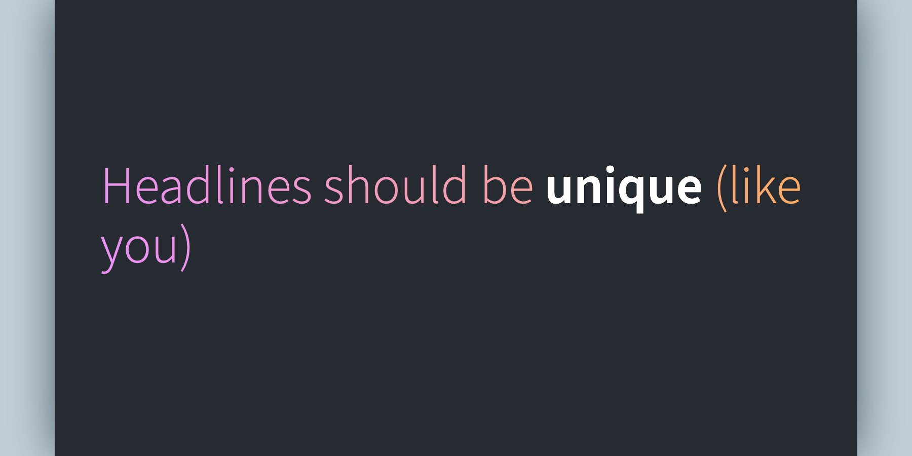
But if the container resizes, the content is changed, translated or localized, or if the user customizes their zoom or text size, we can end up with typographic orphans: A tiny extra word or two, awkwardly tucked away to one side.
That may not seem like a big deal, but small chunks of text are easier for readers to miss. Imagine your favorite quote or catchphrase missing its last word (“a long time ago in a galaxy far, far”) and you’ll understand why designers and marketers sweat these details.
I’ve encountered a lot of different hacks to address this over the years:
- Making the last space in a headline non-breaking (
). - Wrapping certain groups of words in a
spanwithdisplay: inline-blockto exert some control over line breaks. - Using
­to encourage hyphenation of longer words. - Laying out text in a responsive SVG.
- Hiding and showing
brelements at different breakpoints. - Using JavaScript to balance lines (and hoping readers won’t notice the shift).
But none of these are fool-proof, and all have significant shortcomings (issues with dynamic content, fallback fonts, performance, entity encoding, etc.).
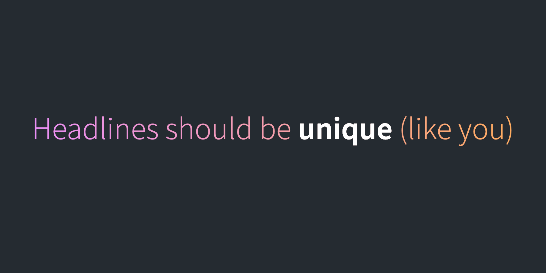
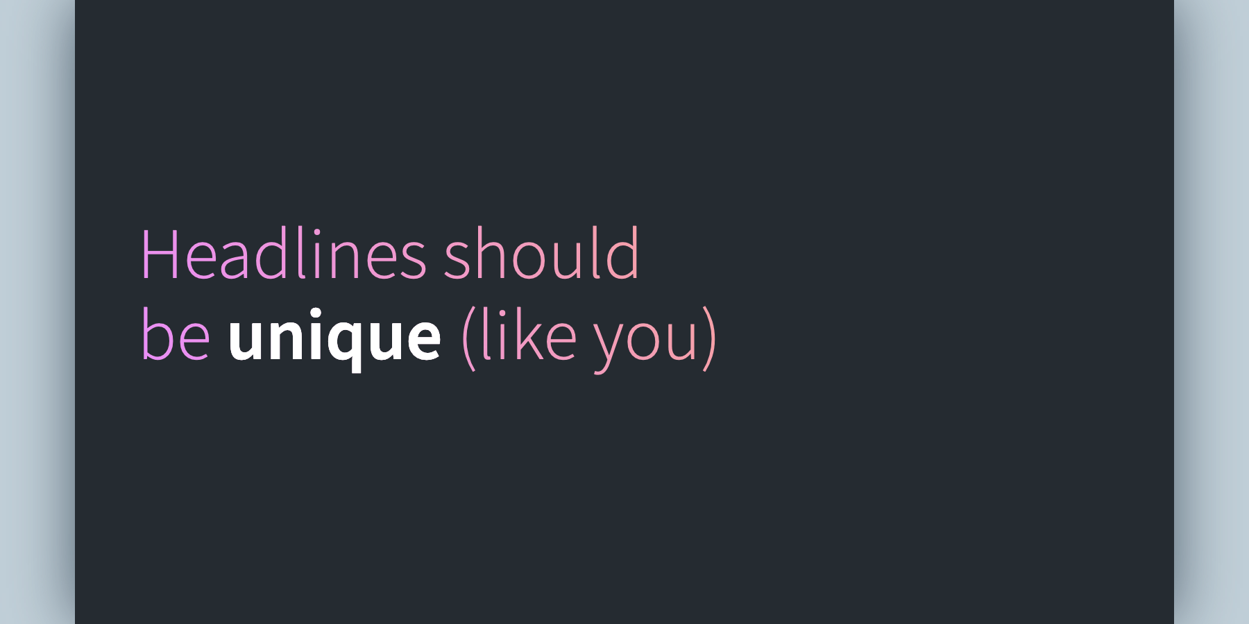
So I was ecstatic when I saw Chrome’s intent to ship CSS headline balancing, nearly a decade after it was first proposed.
As I’m writing this article, you can use text-wrap: balance in Chrome Canary (with Experimental Web Platform features on) and it… just works?! Notice how the text distributes itself more evenly between lines:
Una Kravets shared a great demo of this in action.
I really hope we see positive signals from the Gecko and WebKit teams soon. Let’s spend less time troubleshooting line breaks, more time styling text!
Tyler Sticka is Cloud Four’s VP of Design, allowing him to think about design systems every day. When he isn’t directing his team, sketching on sticky notes or nitpicking CSS, he enjoys reading comics, making video games and listening to weird music. You can follow Tyler on Mastodon.
