
Introduction
The original iPhone was released in June 2007. In late 2008, when we started the research for the first edition of our mobile report, most people still had primitive mobile devices with horrible user experience. At the time, anything that was half-way decent was a pleasant experience compared with the misery caused by most mobile devices and most mobile sites.
Five years ago, when the fourth edition of the mobile report came out, we did a thorough evaluation of the state of mobile usability. At the time, we were happy to report that most mobile apps and websites offered a good mobile user experience. With the fifth edition of our mobile usability report, we continue to see progress.
We’ve finally reached a period of maturity in mobile UX. Mobile design has become stabler and somewhat less open to experiment. Moreover, mobile is mainstream and users might attempt almost any task on mobile (even though they still prefer to do their more important tasks on larger screens). Very few companies no longer have a mobile presence.
Today, most sites and applications offer a good user experience. There are still the occasional glitches, but we can confidently say that the field has made even more progress in the past five years since the last report.
In this article we highlight some of the biggest themes that stood out as we created the report.
User Research
For the fifth edition of our mobile-usability report, we conducted several remote and in-person usability-testing studies involving 19 US-based participants who tested 60 sites and applications. We also used findings and observations from a separate study, which was focused on mobile augmented reality.
Consistent
One of the biggest changes that we noticed in the past few years is a convergence of design styles. Whereas in the past, many mobile sites and apps were still experimenting with new interactions and layouts, today we can say that mobile design has stabilized. Certain patterns have become standard and there is a better understanding of what pattern to use when — for example, the navigation bar and the hamburger menu have achieved a fair balance and sites settle for one or the other (most of the time for the right reasons). Users have become very familiar with these basic types of navigation on mobile and expect to find one or the other on almost every site. They have also learned to take advantage of the hamburger menu in spite of its low information scent — exactly because so many designs use this pattern.
The convergence applies to platforms, not just sites and applications. In many ways, iOS and Android have become more similar to each other and, as a result, many native-application designers can afford to create almost the same UI on the two operating systems, without seriously compromising the usability of the resulting apps. One example is the lack of visible on-screen buttons and the use of the horizontal swipe for Back in both the latest iPhones and the official, Google-released Pixel phones. Another is Apple’s replacement of the 3D Touch with the long press — a gesture that is now used in similar ways on both Android and iOS. (Of course, things are complicated by the fact that Android can be customized by each device manufacturer.)

Content Parity and the Demise of the Full Site on Mobile
In one of our recent mobile usability sessions, we were surprised to encounter a participant who did not know what we meant by “full” site. While there are a few mobile users who prefer to use a desktop site on their phone, the majority do not need to do so. Thanks to the popularity of responsive web design, most sites (even those that are not responsive) today have all their features and content available on both mobile and desktop. There is no reason to want to access the desktop site on mobile.
Additionally, it’s rarer and rarer for content that is not formatted for mobile to be pushed to a mobile screen.
Blurrier Lines Between Native Apps and the Mobile Web
For developers, native apps and mobile websites are different technologies that come with different capabilities. For the user, they are two different interaction channels.
In the past five years, the lines between these channels have become blurrier — at least from users’ perspective.
First, the web has gotten even closer to the native-app world. With the existence of progressive web apps (PWA), we now have mobile websites that look very much like native apps. They can have a dedicated icon on the homescreen and a separate slot in the list of running apps. They can store information on the phone, can run in the background, and (at least on Android) can have access to phone features such as push notifications, that had been, for a long time, not available on the web.

But the native-app world has also made steps to get closer to the web. One of the drawbacks of native apps is that they need to be installed in an app store — the user must spend time (and storage on their phone) to download an app. However, with the introduction of app clips (on iOS) and instant apps (on Android), it is possible for users to use an application that they have not installed on their phone to do a simple task such as order food or pay for parking.

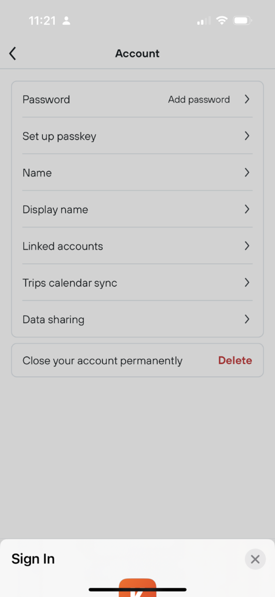
Simpler Login and Registration
A substantial improvement in the state of mobile UX has come from logging in and registration. Mobile designers have long learned the lesson that typing a password is tedious on a mobile keyboard.
There have been multiple developments that have made logging in and registration easier. Some of them are due to biometric methods of authentication (Face ID, fingerprint authentication) and payment (Apple Pay, Google Pay, PayPal, etc.). Others are due to built-in in-browser and on-phone password managers. Yet, others are because designers have finally understood that such flows need to be minimal on mobile.
The most recent trend in registration is passwordless accounts — the ability to create an account without defining a password, which is based on the concept of one-time password (OTP) or magic link. One-time passwords are verification codes sent through a message to the phone number (or email, in the case of magic links) associated with the account.

Apple’s passkeys are another step in the same direction: the system automatically creates such a passkey, stores it encrypted in the cloud, and provides it whenever the user needs to log in to the corresponding site or app. The user does not even know what their passkey is.
Small Screen
In the previous edition we noticed that designers had started to learn to prioritize content over chrome and better respond to the constraints of the small screen. That trend continues today — gone are the days when most of the homepage was used for UI elements and the content was pushed below the fold.
However, the small-screen lesson is not completely learned — we still see pages needlessly lengthened by images and graphics that are decorative and unnecessary, sometimes under the assumption that “mobile users know to scroll.” While that is true, it is not true that mobile users will scroll for the sake of scrolling. They scroll only if they think that the page content is promising enough. If a relevant piece of information is preceded by screenfuls of low-information-value decorations, then they might give up before they reach that piece of information because the page does not look promising.

Too Many Overlays
In the last edition of the report, we deplored the popularity of overlays. If anything, these have become even more popular since. A lot of sites and apps use several layers of overlays — not only for chat bubbles, cookies, and ads, but also for things like main navigation menus and item-detail pages. Unfortunately, even when not annoying, overlays tend to cause many usability problems — some due to buggy implementations, but others because they are perceived as new pages and users accidentally dismiss them because they expect to be able to navigate through them using tools such as the browser’s Back button or the phone’s Back gesture.
In-App Browsers
Another trend is the popularity of in-app browsers. In-app browsers (which are often implemented as overlays) show web content within a browser view inside the app. They have the advantage of keeping the user inside the app and thus saving their context, but they also cause disorientation and confusion, as people can lose track of where they are and have trouble finding again the content presented in such browsers. Moreover, the app UI can interfere with the UI of the page that is displayed in the browser. As a result, a screen may have two conflicting hamburger menus or certain persistent buttons may become invisible due to the specifics of the in-app browser window.


Conclusion
The mobile UX is better than it has ever been. Mobile design has become more consistent across different sites, applications, and even operating systems and users have learned to use and depend on mobile-specific patterns such as the hamburger menu. There is less and less need to access a desktop site on a mobile device. And the capability differences between native apps and the mobile web became less and less pronounced.
But the mobile experience is still far from perfect. Popular elements such as overlays and in-app browsers tend to be buggy and brittle, often causing user confusion and disorientation.
New Research Report
Our mobile-usability findings and guidelines are captured in the new edition of our report Mobile User Experience. Many guidelines reflect the current mobile patterns and interactions; old guidelines that were still retained were revamped with new examples.


